Platform / Update
Introducing Prometheus Metrics Posts on Herb Hub 365
Herb Hub 365 has always been dedicated to sharing the story of our greenhouse, but keeping the site fast and reliable while presenting rich data has been a constant balancing act. Today, we are proud to introduce a new capability that bridges the gap between our real-time monitoring systems and our public blog: the Prometheus Metrics Post feature. This addition allows us to seamlessly integrate high-fidelity data visualizations directly into our Jekyll-based website without compromising the static performance that readers expect.
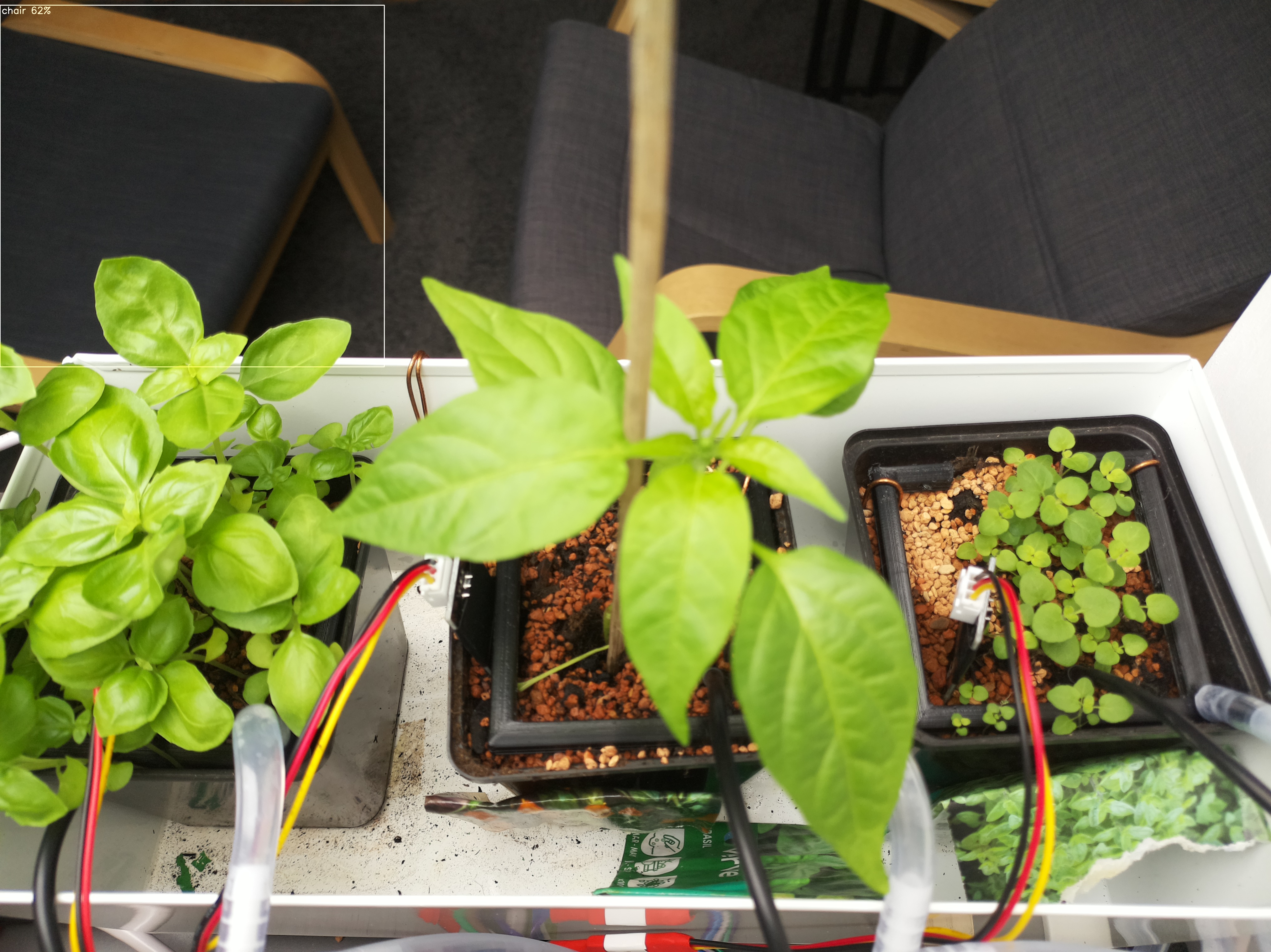
The need for this feature arose as our greenhouse monitoring expanded. We collect a diverse array of environmental data, ranging from ambient conditions like temperature, humidity, pressure, and light levels to specific plant care metrics such as soil moisture, probe temperatures, and water reservoir status. Previously, presenting this data required complex build processes or dynamic server-side rendering, which could slow down the site. The new prom-post mode solves this by automating the entire lifecycle of data visualization. It begins by querying our Prometheus instance for the latest greenhouse sensor data. Using a configurable JSON query file, the system fetches specific time ranges and metrics, ensuring that only the relevant data for the current reporting period is processed.
Once the data is retrieved, the feature exports each metric as a static JSON snapshot. These snapshots are then used to generate a standard Jekyll blog post. What makes this process particularly elegant is how the visualizations are handled. Instead of relying on server-side rendering or heavy JavaScript bundles, the charts are rendered entirely on the client side using interactive ECharts. This means the heavy lifting happens in the browser, keeping the server lightweight and the page load times snappy. The generated posts are automatically committed to the repository and published through our existing Git pipeline, ensuring that the latest insights are available to the community with minimal manual intervention.
We are currently tracking eleven distinct metrics that provide a comprehensive view of our greenhouse health. Readers can explore the environment temperature and humidity to understand the atmospheric conditions, check the pressure and ambient light levels for weather correlation, and monitor soil moisture percentage and sensor voltage for irrigation management. The system also provides visibility into probe temperatures for specific plant zones, tracks the distance to water sources, and displays the percentage and volume of the water reservoir. Additionally, the last run age metric helps us understand the frequency of our automated cycles. All of these data points are accessible on the new Metrics index page, which serves as a centralized dashboard for our project updates.
By committing these charts as static assets, we ensure that the site remains fully static and incredibly fast, regardless of how many visualizations we add in the future. This approach respects the ethos of static site generation while delivering the interactive experience that makes data storytelling engaging. We believe this new feature represents a significant step forward in how we share our work, offering a transparent and efficient way to visualize the progress of our greenhouse experiments for everyone to enjoy.